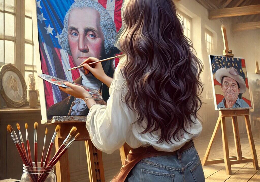
Visual Noise: How Revolutionary Art Was Designed to Disrupt
It did not whisper. It shouted. Revolutionary art was not always balanced or elegant. It did not always follow the rules of harmony or proportion. Much of it was designed to provoke. To overwhelm. To crowd the eye and charge the air. Broadsides overflowed with type. Engravings jammed symbols into tight corners. Images were bold, blocky, and confrontational. This was not visual serenity. It was visual noise. As I painted the mural, I listened closely to that noise. Some of it found its way into the crowd scenes and sky. Take a typical protest print from the 1770s.
It might include a skull, a crown, a serpent, and a broken chain – all in the same frame. Each object carried symbolic weight, and none was placed for subtlety. The goal was not contemplation. It was reaction. These prints were pasted onto posts, tacked to tavern walls, or stuffed into newspapers. Their mission was simple. Be seen. Typography played its part. Words were often hand-set in uneven blocks, with clashing fonts and sudden shifts in size. Phrases ran bold across the top. Smaller text filled every margin. The eye had no place to rest. That density created urgency. You could not walk past one of these broadsides without feeling the visual impact. They shouted at you, even without sound.
In painting the mural, I had to decide how much of that noise to include. Too much would overwhelm the composition. Too little would feel dishonest to the era. I chose key places where the visual field tightens. A group gathers around a pamphlet nailed to a wall. Figures overlap. Faces blur. A printed notice slants sideways, as if hastily stapled. These sections do not calm the viewer. They activate. They recreate the energy of protest. What fascinates me is how intentional this visual chaos often was.
Artists like Paul Revere and Amos Doolittle used line work not only to render figures but to stir movement. Smoke billowed into words. Clouds turned into symbols. Crowd scenes exploded outward, with no clear center. This centrifugal force mirrored the mood of the time. The world was shifting. The lines refused to settle. In the mural, I placed similar energy in the banners and handwritten signs. Some are angled awkwardly. Others overlap. A protester’s hand blocks part of a message. These compositional choices create friction. They ask the viewer to pause, reposition, and read again. That pause is part of the message. Revolutionary art wanted you to look twice.
Even color served disruption. Reds clashed with ochres. Black ink bled into rough paper. These were not carefully coordinated palettes. They were built from what was available. And that made them feel urgent. That urgency lives in every shout across the mural’s walls. The crowd does not move in harmony. It surges.
Visual noise may not be pleasant, but it is powerful. It wakes the eye. It compels attention. The artists and printers of the Revolution understood this. They did not aim for perfection. They aimed for participation. Their work was not polished. It was pointed. And in that cacophony, a message became impossible to ignore.

