Typography as Tactics: The Visual Warfare of Revolutionary Print
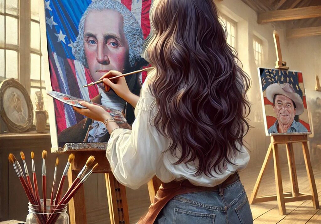
Long before the Declaration of Independence was signed, it was printed. And that moment wasn’t just about words – it was about how those words looked. Revolutionary typography wasn’t decorative. It was deliberate. Every line break, every flourish, every towering capital letter was a form of resistance. The visual arrangement of words on a page became as calculated as the musket lines on the battlefield. For me, as a painter reinterpreting these moments, this was a revelation: typography was strategy.
In the mural’s Unity section, we honor the role of print in binding the colonies together. Newspapers, broadsides, handbills – they appear tucked in the hands of townspeople, nailed to tavern doors, or cascading from windows. But beyond their presence as props, I thought about what those pages really looked like. I imagined the thick ink, the coarse paper, the uneven pressure of a hand-cranked press. These weren’t documents. They were declarations.
During the 1770s, colonial printers were among the most subversive craftsmen in America. They had to be. The words they printed – often anonymous, always inflammatory – had to shout without sound. That’s where typography came in. Using all-caps to evoke urgency, bold blackletter fonts for gravity, italics for sarcasm or emphasis, printers constructed visual hierarchies that guided emotion. A pamphlet might scream “TYRANNY” in fifteen-point block type, then soften into moral argument below. The layout itself created a rhythm of alarm and persuasion.
Printers like Isaiah Thomas, John Dunlap, and Mary Katherine Goddard understood the stakes. These weren’t passive artisans. They were conductors of public mood. Their choices – whether to justify a column, break a line early, or indent a quote – could tilt meaning. If a king’s edict appeared in the same typeface as a radical rebuttal, it wasn’t a mistake. It was typographic defiance. The battlefield was the printed page, and every serif had sharp edges.
When I studied original documents in museum archives, I noticed something subtle: urgency lived not just in what was said, but how it appeared. Revolutionary print was dense, but never dull. It had a pulse. There were rules, and then there were the moments that broke them – words set at angles, punctuation exaggerated for effect, blocks of text suddenly split to highlight a phrase like “LIBERTY” or “TO ARMS.” This was propaganda in its most visual form. And unlike paintings or oratory, these prints multiplied. One typeset sheet became hundreds. Ink became a contagion. In translating this into the mural, I avoided rendering exact text. That would have reduced these documents to captions. Instead, I focused on visual impression – the crowded columns, the slanted headlines, the texture of urgency.
Behind one figure, a newspaper flutters from a windowsill. Its bold header isn’t legible, but the mood is unmistakable. It reads like fire. It’s easy to romanticize calligraphy and ornamental script, especially from the 18th century. But the Revolution wasn’t a script. It was block type. Ink-stained. Dense. Unapologetically loud. Typography became a kind of military drumbeat, driving home ideas with visual weight. I’ve always said that good art makes you feel something before you understand it. Revolutionary printers knew this instinctively. Their prints did more than inform – they provoked.
Even the physicality mattered. The weight of the paper, the smell of ink, the uneven edge of a hand-trimmed sheet – these were visceral experiences. Readers didn’t just see the message. They handled it. Passed it from hand to hand. Nailed it to trees. Burned it in taverns. In my depiction of the Liberty Tree, I included faint outlines of pasted-on broadsides, barely readable. They’re not focal points. They’re spectral presences – whispers of typography that once roared.
Today we scroll past fonts, but back then, type spoke volumes. It shouted across colonies. It whispered warnings. It laid out grievances like manifestos. The Revolution was a war of words, yes – but also of how those words appeared. In painting these moments, I’ve come to believe this: typography was never neutral. It was a tool. A weapon. And in the hands of revolutionaries, it was wielded with precision.

